


Dialing from Canada? Tel: 204-480-8832
Dialing from the USA? Tel: 727-388-6918
Email: info@apollomarconi.com


A few stills from our 60 second video ‘Another Day at the Office’
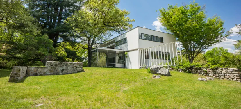
Here, a few options we drew for the sidewalk entry canopy that leads to the front door of (the)
Gropius House. This deploys some of the methods we used at the TALISMAN condos in Seattle.
As the view up the drive-
way does not feature an
angle on this entry, not
many would see it here –
but it was begging for
some lettering, even if
this particular face isn’t
the one. Why? It breaks a
few legibility rules, which
I will go into elsewhere,
but which include the
font’s very small coun-
ters/negative space.


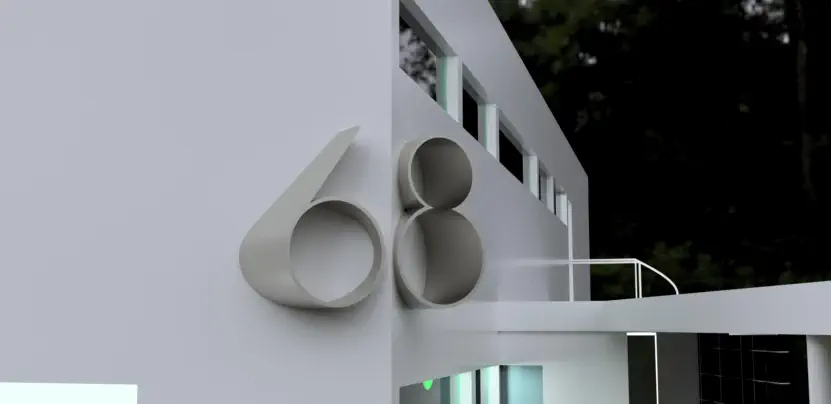
When in Rome…yes, so what if we’re in Massachusetts? When the house went up in 1938,
the world had long since moved to Arabic numerals, but for love of the Roman format it-
self, we’ve drawn them here (using the Bauhaus 93 font, not around in 1938 either).
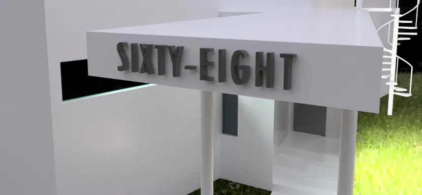
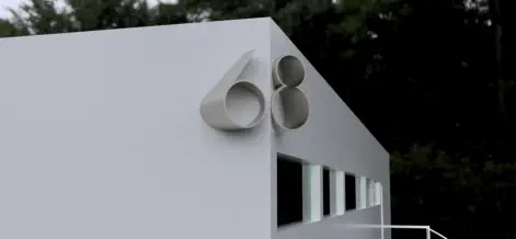
Something for the horizontal aperture outside the kitchen door on the south side of the house.
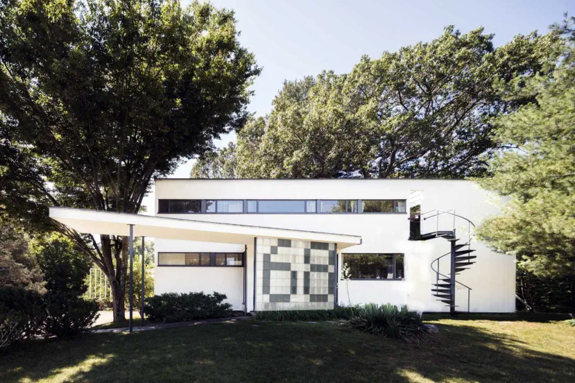

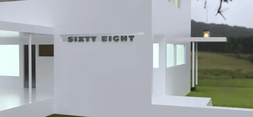
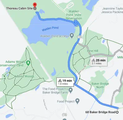
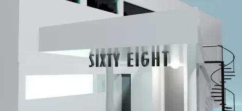
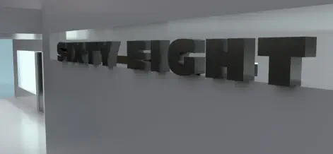
How about the north side? Let’s say someone has come from Cambridge or Lincoln and overshot
the driveway turnoff. They look over their left shoulder while speeding west. Why not provide
something to set them straight; to brook no uncertainty?

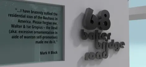
Marcel
Breuer’s
house


PASSENGER
“Was that sixty
eight?”
DRIVER
(Looks left)
“Yup”


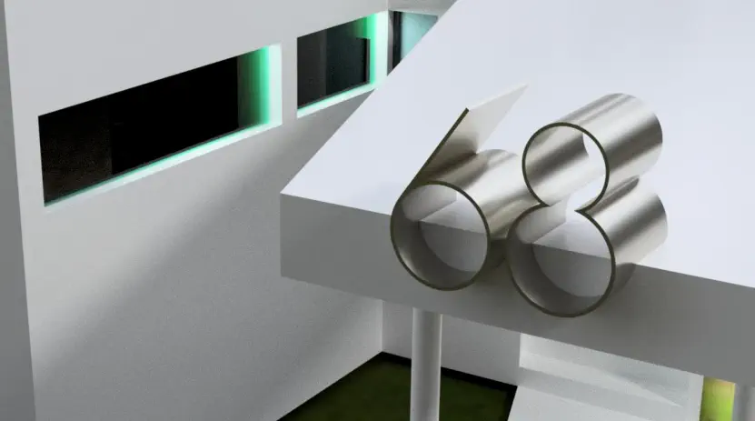
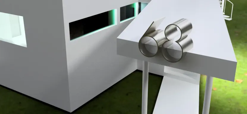
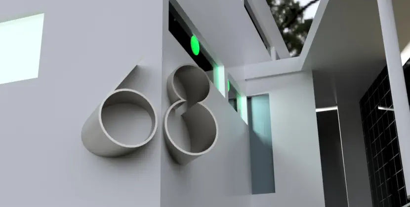
For a Marcel Breuer influence, we explored tubular steel (as did Breuer with his iconic Wassily
chair and others) & exploit the Gropius’s neighbor’s love of bicycles, their engineering & and
their chief component: tubes (this time, scaled UP). Rolled aluminum, Cor-Ten or stainless.
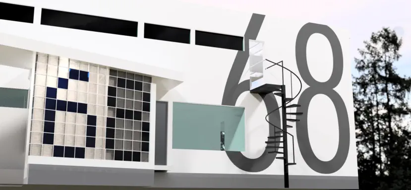
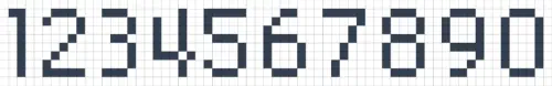
Have we inadvertently created an anachronism? Probably not,
as grid paper at the Bauhaus would have naturally given way
to coloured-in squares, itself a naive typography predating the
20th century’s LCD/LED fonts.
Of all the Futura family members, the only one where the bot-
tom story of the 8 is the same height as that of the 6 is Futura
Light Condensed. See drawing, next. (FYI: our own NeoMetro1
borrowed its 4, 6 and 9 from Futura Light).


There’s more to be said regarding this thought experiment, but for now we’ll leave it right here,
and say “to be continued…” - If any of these approaches stuck a chord with you, get in touch for
more on how we can help make an address statement happen for you.


Dialing from Canada? Tel: 204-480-8832
Dialing from the USA? Tel: 727-388-6918
Email: info@apollomarconi.com


A few stills from our 60 second video
‘Another Day at the Office’
Here, a few options we drew for the sidewalk entry
canopy that leads to the front door of (the) Gropius
House. This deploys some of the methods we used at
the TALISMAN condos in Seattle.

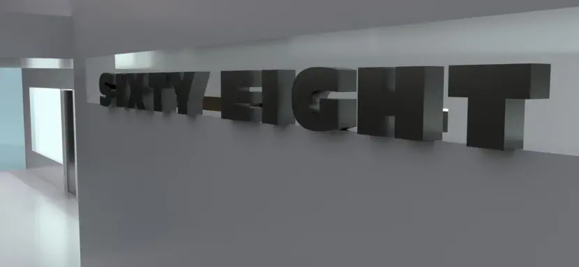
As the view up the driveway
does not feature an angle
on this entry, not many
would see it here – but it
was begging for some let-
tering, even if this particu-
lar face isn’t the one. Why?
It breaks a few legibility
rules, which I will go into
elsewhere, but which in-
clude the font’s very small
counters/negative space.
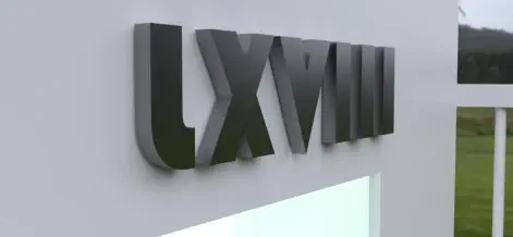
When in Rome…yes, so what if we’re in
Massachusetts? When the house went up in 1938,
the world had long since moved to Arabic numer-
als, but for love of the Roman format itself, we’ve
drawn them here (using the Bauhaus 93 font, not
around in 1938 either).
Something for the horizontal aperture outside the kit-
chen door on the south side of the house.

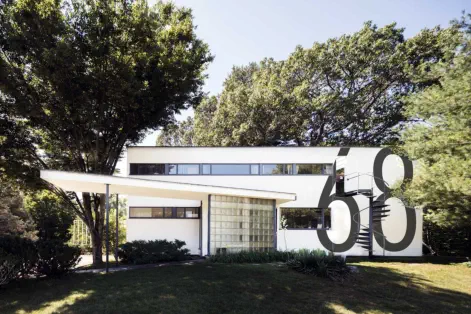

How about the north side? Let’s say someone has
come from Cambridge or Lincoln and overshot the
driveway turnoff. They look over their left shoulder
while speeding west. Why not provide something to set
them straight; to brook no uncertainty?

Marcel
Breuer’s
house


PASSENGER
“Was that sixty eight?”
DRIVER
(Looks left)
“Yup”


For a Marcel Breuer influence, we explored tubular
steel (as did Breuer with his iconic Wassily chair and
others) & exploit the Gropius’s neighbor’s love of bi-
cycles, their engineering & and their chief component:
tubes (this time, scaled UP). Rolled aluminum, Cor-Ten
or stainless.
Have we inadvertently created
an anachronism? Probably not,
as grid paper at the Bauhaus
would have naturally given way
to coloured-in squares, itself a
naive typography predating the
20th century’s LCD/LED fonts.
Of all the Futura family members, the
only one where the bottom story of
the 8 is the same height as that of the
6 is Futura Light Condensed. See
drawing, next. (FYI: our own
NeoMetro1 borrowed its 4, 6 and 9
from Futura Light).


There’s more to be said regarding this thought experi-
ment, but for now we’ll leave it right here, and say “to
be continued…” - If any of these approaches stuck a
chord with you, get in touch for more on how we can
help make an address statement happen for you.